A breadcrumb (or “breadcrumb trail”) is a type of secondary navigation that reveals the user’s location in a website or web application.
Usage
When to use
- To display the hierarchy and location of the current page.
- While not required for every page, a breadcrumb is highly encouraged for the majority of pages with the exception of high-level overviews and dedicated workflows.
When not to use
- As links outside of the page header.
- Within a body of text, use InlineLink
- As a standalone element or within a Button Set, use a StandaloneLink
Item types
Text only
With icon
Truncated
Icons
- Icons should only be added to the first three levels to avoid unnecessary visual noise.
- Icon usage should be inherited and not randomly added to a level (if a higher level uses an icon, the level just under it can also use one).
Truncation
If truncation is needed due to depth or lack of space, use one of the following options. Breadcrumbs will truncate using truncate middle if there are more than five items to display. Truncate middle is recommended unless space is an issue.
Truncate middle
Truncate squeeze
Each text-based item can truncate using a pixel-based max-width at the discretion users discretion. This option should be reserved for instances when items have long text strings.
Width-based
Width-based (Hover)
Dropdowns
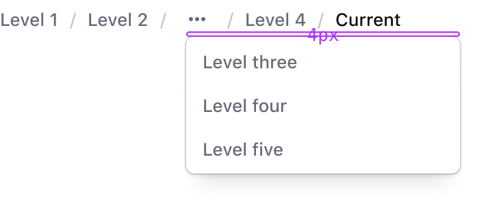
For truncated breadcrumb items, clicking, pressing enter, or pressing spacebar will open the truncated dropdown. The truncated dropdown will align to the left side of the breadcrumb item and will be placed 4px below the breadcrumb item.
Truncated dropdowns will include all of the hierarchal layers that have been hidden.
Truncated dropdown

How to use this component
The breadcrumb is an application-level UI element, so it’s likely that it will be implemented once per application.
Basic use
<Hds::Breadcrumb>
<Hds::Breadcrumb::Item @text="My org" @icon="org" />
<Hds::Breadcrumb::Item @text="Consul" @icon="consul" />
<Hds::Breadcrumb::Item @text="my-consul-cluster" />
<Hds::Breadcrumb::Item @text="Overview" @current= />
</Hds::Breadcrumb>
With routing parameters
In the basic example a few parameters are omitted for clarity. In reality, each breadcrumb item is expected to be a link, in order to work, the correct @route/@models/@model/@query parameter needs to be passed to the breadcrumb container:
<Hds::Breadcrumb>
<Hds::Breadcrumb::Item @text="My org" @icon="org" @route="components" />
<Hds::Breadcrumb::Item @text="Consul" @icon="consul" @route="components" />
<Hds::Breadcrumb::Item
@text="my-consul-cluster"
@route="components"
@model=
/>
<Hds::Breadcrumb::Item @text="Overview" @current= />
</Hds::Breadcrumb>
No wrapping
By default, the breadcrumb allows items to wrap on multiple lines if the container width is too small. If you don’t want this to happen, pass false to the itemsCanWrap parameter, but keep in mind that the text will be automatically replaced with an ellipsis to fit the container:
<Hds::Breadcrumb @itemsCanWrap=>
[items here]
</Hds::Breadcrumb>
With truncation
It is also possible to collect and hide part of the breadcrumb tree under a "truncated" item that will show the elements via "toggle":
<Hds::Breadcrumb>
<Hds::Breadcrumb::Truncation>
<Hds::Breadcrumb::Item @text="My org" @icon="org" @route="components" />
<Hds::Breadcrumb::Item @text="Consul" @icon="consul" @route="components" />
<Hds::Breadcrumb::Item @text="my-consul-cluster" @route="components" />
</Hds::Breadcrumb::Truncation>
<Hds::Breadcrumb::Item @text="Cluster details" @route="components" />
<Hds::Breadcrumb::Item @text="Cluster sub-details" @current= />
</Hds::Breadcrumb>
Component API
The breadcrumb component is composed of three different parts, each with their own APIs:
- a main “container” (the breadcrumb itself)
- an “item” child component (a single “crumb”)
- a “truncation” child component (a hidden list of “crumbs” that can be made visible via a toggle)
Breadcrumb container
- Name
-
itemsCanWrap - Type
-
boolean - Values
-
- false
- true (default)
- Description
- This controls if the breadcrumb items can wrap in case they don’t fit in the container width.
- Name
-
didInsert - Type
-
function - Description
-
This hook method is called when the component is inserted in the DOM. Internally we use the
did-insertmodifier from@ember/render-modifiers.
- Name
-
…attributes - Description
-
This component supports use of
...attributes.
By default an attributearia-label="breadcrumbs"is assigned to the component. If you want to localize it you can override it passing the same attribute with a different value.
Breadcrumb::Item
- Name
-
text - Type
-
string - Description
- The text shown within the item, or "crumb".
- Name
-
icon - Type
-
string - Description
- Use this parameter to show an icon. Any icon name is acceptable.
- Name
-
route/models/model/query - Description
-
These are the parameters that are passed down as arguments to the
<LinkTo>component.
- Name
-
current - Type
-
boolean - Values
-
- false (default)
- true
- Description
- Determines if an item is the last item in the breadcrumb, in which case it doesn’t generate a link.
- Name
-
…attributes - Description
-
This component supports use of
...attributes.
Breadcrumb::Truncation
- Name
-
yield - Description
- Elements passed as children of this child component are yielded to the content of the Disclosure component (used to show/hide the yielded breadcrumb items via a "toggle" button).
- Name
-
…attributes - Description
-
This component supports use of
...attributes.
Anatomy
Breadcrumb item

| Element | Usage |
|---|---|
| Text | Required (unless using a truncated item) |
| Leading icon | Optional - color and size of the icon is pre-defined. Note: If a truncated item, the leading icon must be a "more-horizontal" icon. |
| Focus ring | Focus state only |
Breadcrumb container

| Element | Usage |
|---|---|
| Item | Multiple items can be passed to the breadcrumb container of varying types and combinations |
| Separator | Required for all breadcrumb items except the last item. |
| Current page | The last item in the breadcrumb should always be the current page, not interactive, and styled with Foreground / Strong for the text color to meet accessibility requirements. |
States
Default

Hover

Active

Focus

Conformance status
This component has been designed and implemented with accessibility in mind. However, if the truncation feature is used, this component would not pass a WCAG conformance audit.
Known issues
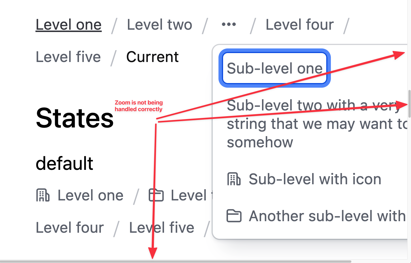
When the browser zoom is used to scale content to 400%, if the breadcrumb has a "truncation" open, the dropdown may extend beyond the viewport and require the user to scroll in more than one direction (this is a failure of Reflow – 1.4.10).

When the browser zoom is used to scale content to 400%, if the breadcrumb is not allowed to wrap its items (via the @itemsCanWrap prop) the text will likely get truncated, making it impossible for a keyboard-only user to access the truncated content.

Applicable WCAG Success Criteria
This section is for reference only. This component intends to conform to the following WCAG Success Criteria:
-
1.3.1
Info and Relationships (Level A):
Information, structure, and relationships conveyed through presentation can be programmatically determined or are available in text. -
1.3.2
Meaningful Sequence (Level A):
When the sequence in which content is presented affects its meaning, a correct reading sequence can be programmatically determined. -
1.4.10
Reflow (Level AA):
Content can be presented without loss of information or functionality, and without requiring scrolling in two dimensions. -
1.4.12
Text Spacing (Level AA):
No loss of content or functionality occurs by setting all of the following and by changing no other style property: line height set to 1.5; spacing following paragraphs set to at least 2x the font size; letter-spacing set at least 0.12x of the font size, word spacing set to at least 0.16 times the font size. -
1.4.3
Minimum Contrast (Level AA):
The visual presentation of text and images of text has a contrast ratio of at least 4.5:1 -
1.4.4
Resize Text (Level AA):
Except for captions and images of text, text can be resized without assistive technology up to 200 percent without loss of content or functionality. -
2.1.1
Keyboard (Level A):
All functionality of the content is operable through a keyboard interface. -
2.1.2
No Keyboard Trap (Level A):
If keyboard focus can be moved to a component of the page using a keyboard interface, then focus can be moved away from that component using only a keyboard interface. -
2.4.3
Focus Order (Level A):
If a Web page can be navigated sequentially and the navigation sequences affect meaning or operation, focusable components receive focus in an order that preserves meaning and operability. -
2.4.5
Multiple Ways (Level AA):
More than one way is available to locate a Web page within a set of Web pages except where the Web Page is the result of, or a step in, a process. -
2.4.6
Headings and Labels (Level AA):
Headings and labels describe topic or purpose. -
2.4.7
Focus Visible (Level AA):
Any keyboard operable user interface has a mode of operation where the keyboard focus indicator is visible. -
3.2.3
Consistent Navigation (Level AA):
Navigational mechanisms that are repeated on multiple Web pages within a set of Web pages occur in the same relative order each time they are repeated.
Support
If any accessibility issues have been found within this component, please let us know by submitting an issue.